In a Pickle
In a Pickle
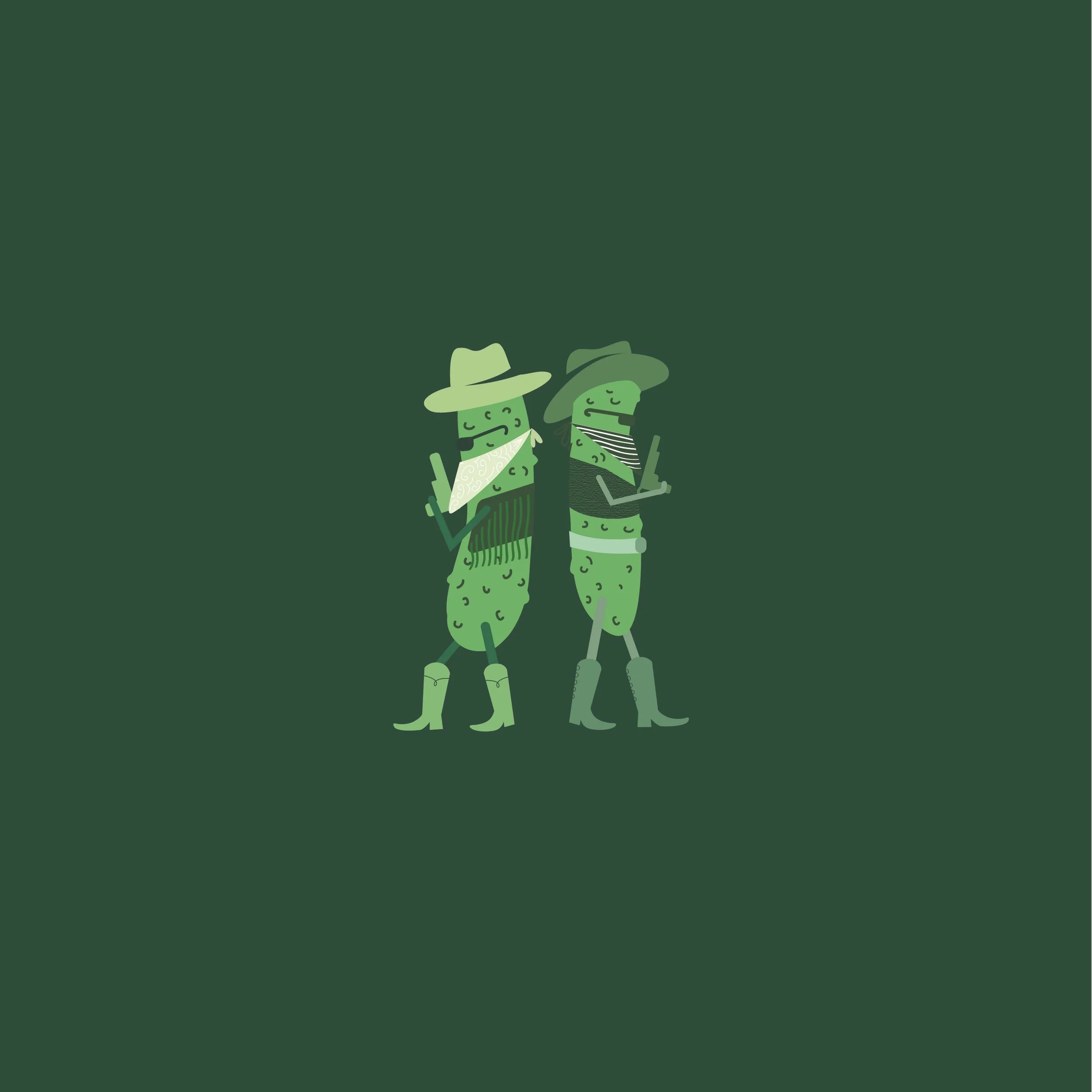
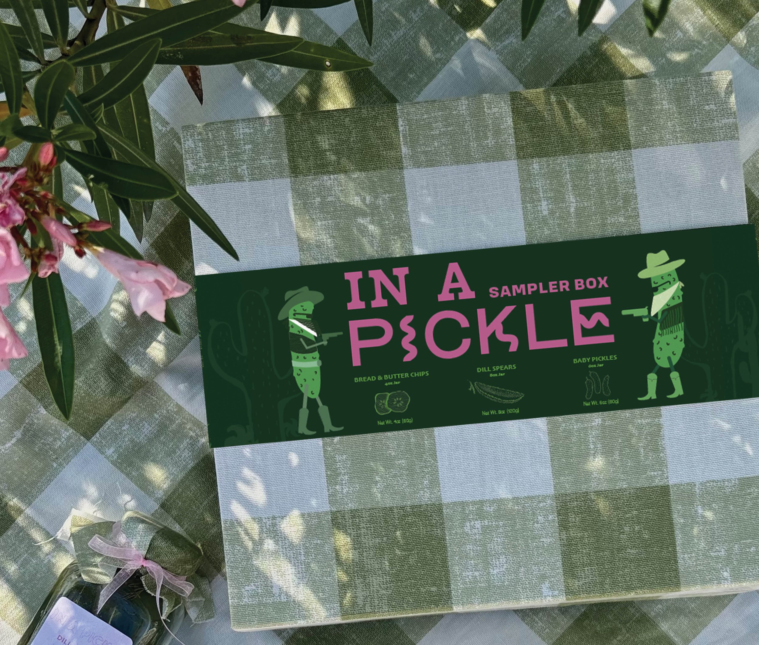
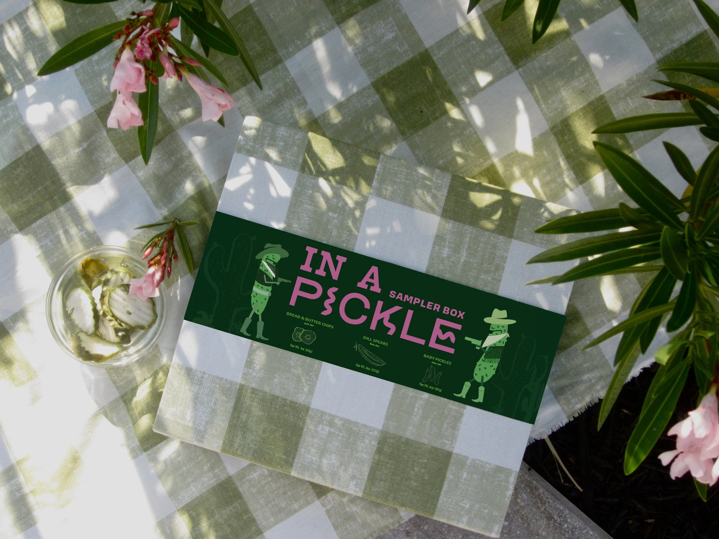
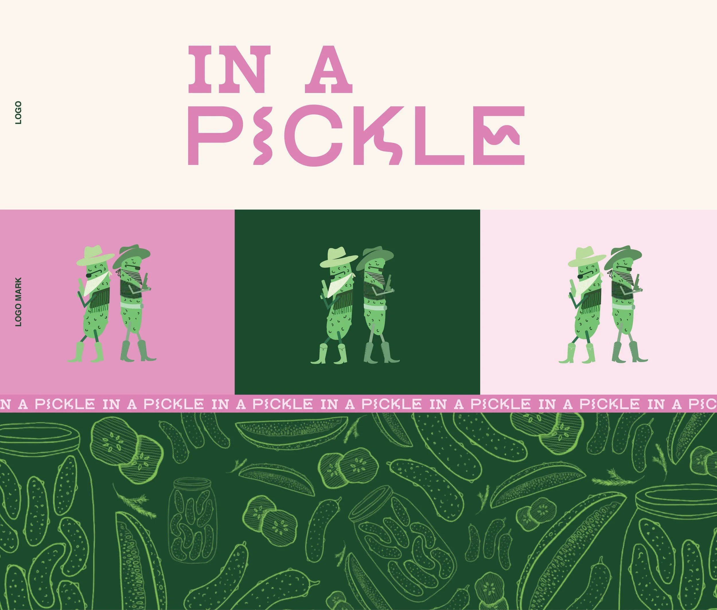
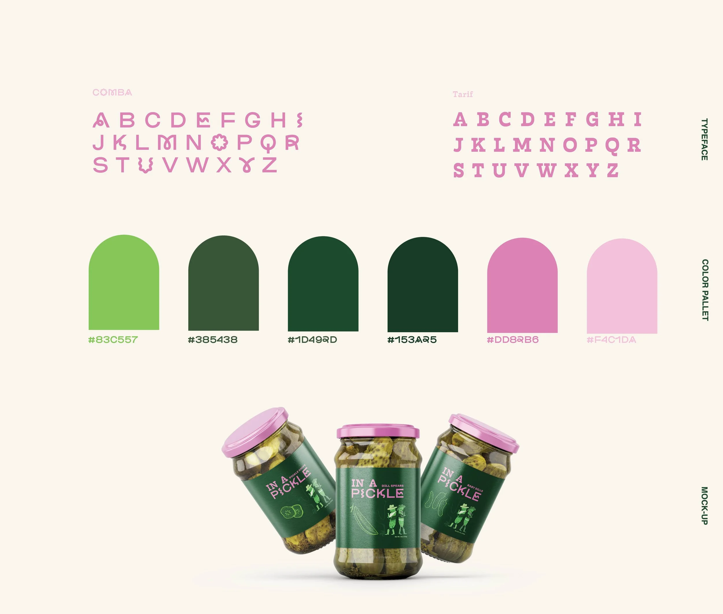
Do you ever just have one of those days where you feel like you have hit every stop light, speed bump, and pot hole in plain sight, but still trying to make it to that very important meeting, because same. Dare I say, you were feeling In A Pickle? This project was inspired by that very moment of almost not making that important meeting. The Brand In A Pickle encapsulates that very feeling in a very playful way. In a Pickle is an all American pickle brand, that sells the quintessential hostess gift being the pickle sampler box to bring to a summer BBQ. It combines aesthetics mixing Western culture with a modern approach. The two pickle mascots are nothing short of being In A Pickle, as they face off in a western duel. The two typefaces Chosen, Tarif & Comba, play into the combining aesthetics in the branding. Tarif being used for the “In A” has that classic western feel being a slab serif, and “Comba” used for “pickle” is a fun and playful typeface.
Project: Branding & Packaging Design
Tools: Illustrator, InDesign, Photoshop
Role: Creative Director
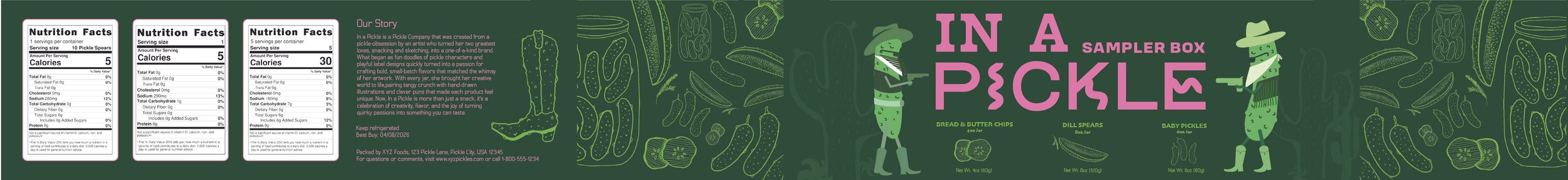
Packaging Belly Band
#inapickle
#inapickle
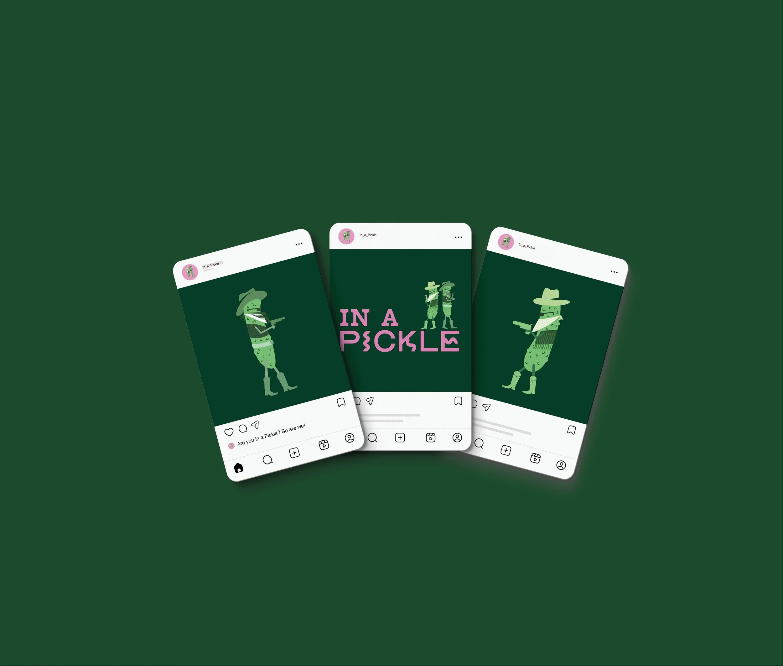
In a Pickle features playful mascot characters designed as pickles caught in a duel—visually capturing the idea of being “in a pickle.” The branding leans into these characters, using their expressions and interactions to create a fun, engaging identity that brings personality and storytelling to the overall design.The mascots are used throughout the entire brand system, extending across social media, marketing materials, and other touchpoints to create a cohesive and recognizable visual presence.